To calculate the Wellbeing Inequality Ratio, Gallup looks at the distribution of answers to the following question:
Please imagine a ladder with steps numbered from zero at the bottom to 10 at the top. Suppose we say that the top of the ladder represents the best possible life for you, and the bottom of the ladder represents the worst possible life for you. On which step of the ladder would you say you personally feel you stand at this time?
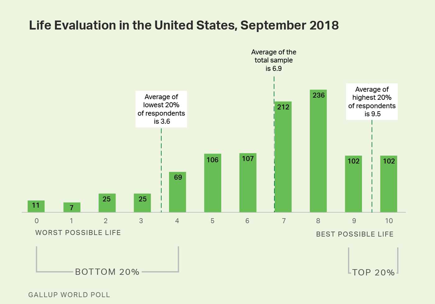
Respondents can rate their lives between a zero and a 10 (they can also voluntarily respond "don't know" or "refuse"). This results in a range of answers across the scale. The accompanying chart shows the results for the United States in September 2018. The bar over each rating represents how many respondents provided that answer. The taller the bar, the more respondents provided that answer. The average score across all the respondents was 6.9.
The Wellbeing Inequality Ratio looks at the "tails" of the distribution, by focusing on the average of the highest 20% of respondents and the average of the lowest 20% of respondents. In this example, there are 1,000 total respondents. The average life evaluation score of the top 200 respondents is 9.5. The average life evaluation score of the lowest 200 respondents is 3.6. The score of 9.5 is 2.6 times higher than 3.6 (in other words 9.5/3.6 = 2.6). Therefore, the Wellbeing Inequality Ratio for the United States in September 2018 was 2.6.
The shape of these distributions varies significantly from one country to the next. In countries where most respondents give an answer close to the national average, the distribution is tall and thin, meaning the country has a low Wellbeing Inequality Ratio. The Netherlands had the lowest Wellbeing Inequality Ratio in 2018, at 1.5.
In countries where respondents give a wide array of answers, the distribution is short and flat. These countries have a high Wellbeing Inequality Ratio. Examples are Sierra Leone, Zimbabwe or Liberia.
In countries such as these, almost the entire group of people in the lowest 20% report a "0" on the life evaluation question, meaning the average of the lowest 20% is very close to zero. This makes the denominator of the Wellbeing Inequality Ratio very low, resulting in a very high ratio. Because there are 11 response options (0 through 10), we cap the ratio at 11, the furthest possible distance from one side of the scale to the other, representing the greatest wellbeing inequality possible.
Countries that have a high Wellbeing Inequality Ratio tend to have low GDP per capita levels, low Human Development Index scores and are considered less stable by the Fragile States index. On the other hand, the countries with the lowest Wellbeing Inequality Ratios generally have the highest GDP per capita levels, rank the highest in the Human Development Index and are considered very stable in the Fragile States Index.
Learn more about how the Gallup World Poll works.
For complete methodology and specific survey dates, please review Gallup's Country Data Set details.