Most conversations about development these days focus on income inequality and people's wellbeing. But a new Gallup analysis suggests these conversations might be better focused on the inequality in people's wellbeing.
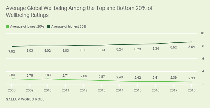
Gallup's data show that worldwide, with every passing year since the Great Recession, life has gotten better for people with wellbeing scores in the top 20% and worse for people with wellbeing scores in the bottom 20%.
In 2008, the average score for people with wellbeing scores in the top 20% was 7.92, while last year, the average score was 8.64, representing a 0.72-point increase. At the same time, the average score for people with scores in the bottom 20% was 2.84 in 2008. Since then, average ratings among the people with the lowest scores have for the most part drifted downward, reaching 2.33 in 2018, representing a 0.51-point decrease.

The growing inequality in how people rate their lives shows millions of people are clearly being left behind. But more than that, the widening gap in how people rate their lives may be able to provide a better, more complete picture of inequality in a country than income inequality alone.
In the coming weeks, through a series of articles, we will explore what the full picture looks like around the world.
What Is Wellbeing Inequality?
Gallup uses several approaches to measure wellbeing, including asking adults to rate their lives using the Cantril Self-Anchoring Scale. Respondents are asked to rate their life on a scale from 0 to 10, with 0 being the worst possible life and 10 being the best possible life. The individual data can then be examined at the country level to produce country averages. These averages vary significantly from country to country, and are reported by the United Nations in its World Happiness Report each year.
While studying national averages illustrates important differences between countries, to gain a greater understanding of wellbeing inequality it is important to analyze differences within countries.
Comparing the average response of the top 20% (people who gave the highest life evaluation scores) to the average response of the bottom 20% (those who gave the lowest life evaluation scores) can provide significant insight. While two countries may have the same national wellbeing average, their wellbeing inequality may be very different.
Capturing a Country's Level of Wellbeing Inequality
We can better understand how unequal wellbeing is within a country through a single metric: the Wellbeing Inequality Ratio. This metric is determined by dividing the top 20% average life evaluation score within a country by the bottom 20% average score, to get a ratio that illustrates how many times "better off" people at the top are compared with those at the bottom.
The ratio has a minimum of 1 and a maximum of 11. At 1, a country would essentially have no wellbeing inequality between the top 20% and the bottom 20% of society. At the other end of the spectrum, 11 represents the maximum possible level of inequality between the two groups. Countries can have similar levels of average wellbeing but very different ratios because of differences in the averages between these two groups.
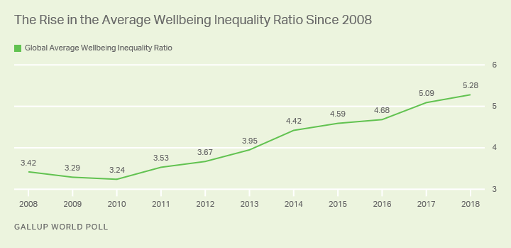
Since 2008, the average Wellbeing Inequality Ratio across all countries was at its lowest in 2010 at 3.24, meaning there was the least wellbeing inequality in 2010. That figure has continued to grow each year, though, and 2018 saw the highest level of wellbeing inequality, with a ratio of 5.28.

The Wellbeing Inequality Ratio as a Powerful Tool
Typically, discussion about inequality involves income. People care about income inequality because they implicitly assume that it affects a country's development and its wellbeing. The Wellbeing Inequality Ratio is a more direct measure of the disparity of wellbeing within a country. Therefore, depending on what you are measuring, the Wellbeing Inequality Ratio is a more straightforward measure of inequality within a country. Another advantage is that reliable wellbeing data are easier to obtain than income data for most countries around the globe.
Measuring inequality through a subjective wellbeing metric such as life evaluation allows each respondent to consider all the issues of their life that are important to them and to factor them into their rating accordingly. Income inequality, on the other hand, looks at only one component of what is important to people.
Gallup's analysis shows that countries with lower Wellbeing Inequality Ratios generally have higher GDP per capita and higher scores on the Human Development Index, and are considered more stable on the Fragile State Index. This analysis will be further developed in future Gallup.com articles that look at how the Wellbeing Inequality Ratio changes across regions and countries, how it relates to income and economic growth, and what the key factors are in wellbeing inequality.


